Tuesday, December 20, 2011

Algorithmic Trading of Precious Metals

By Fred Novomestky, Ph.D

Algorithmic trading has become both a significant new trend in financial markets and for many seasoned professionals, a pariah. A closely related concept is high frequency trading. A brief check of Wikipedia gives you a concise description. There are two important characteristics of algorithmic trading which is also known as Algo, Black-Box, or Robo trading. The first is the use of electronic platforms for entering trading orders. The second is the use of algorithms or quantitative oriented decision making tools that determine the timing, pricing, or quantity of the order. Often the orders are initiated without human intervention.

Algorithmic trading has been in use for decades even before the advent of electronic financial markets. Buy side institutional investors with in house index funds have performed periodic re-balancing of their portfolios using block trading. In principle, algorithmic trading can be used for all asset classes and any investment strategy. In 2006, more than one third of all European Union and United States stock trades were driven by automatic programs. This trend is expected to continue to grow. In the words of Thomas Friedman (author of The World Is Flat) , “Access to electronic markets has contributed to leveling the playing field among institutional and individual traders.”

There is of course a dark side to automatic systems. First of all is their black box nature. Traders tend to have an intuitive view of how the world works. When pitted against numbers spewing from a mathematical model, sometimes the intuition is lost. The Flash Crash of May 6, 2010 was impacted by both algorithmic and high frequency trading.

This blog looks to evaluate the value of daily re-balancing of a portfolio that combines fully margined gold and silver futures contracts. All the previous blogs on precious metals have assumed that all portfolios are rebalanced at the end of each month. We will illustrate a very simple, transparent, and intuitive algorithm for re-balancing these two commodities. There are two underlying features of the model. The features mimic the behavior of options traders. The first is to let the profits run. As one commodity tends to do better than the other, move more capital towards that commodity. The second is to cut the losses short. When the total portfolio is losing value, lock in the profits and reduce exposures. The relative valuation is through the changes in allocation between the two commodities.

Tables 1 and 2 illustrate the strategy for the time period December 31, 1990 to January 31, 1991. On market close of December 31, 1990 the allocation to gold and future is set to equal weight just as our favorite precious metal portfolio in previous blogs. These are highlighted in the pair of columns with the label Begin Weight. These percents are applied to the portfolio value which is initially $1,000,000. The next two columns show the beginning market values of the positions. The daily returns of the gold and silver futures contract appear in the pair of columns called Total Return. These returns are applied to each of the beginning values to obtain the Gains and Losses.

Continuing with Table 2, the gains and losses are applied to the beginning values to obtain the End Values for each position and the total portfolio. A note is made if the end value of the portfolio has increased since the previous day (+1) or decreased (-1) in the Increase column. Using the end values, the End Weights as a percent of total portfolio value are computed. The next two columns show the change in the weights of the gold and futures from the begin weights to the end weights. This tells us information about the relative performance of the two commodities. For January 2, 1991 there is no change in weight due to zero returns. For January 3, 1991, the change in gold was -0.73% while the change in silver was +0.73%. This indicates that relatively speaking, silver outperformed gold. Also, with a +1 in the Increase column, the value of the portfolio increased. The Target Weights are computed using a simple formula which is [End Weight] + [Increase] * [Multiplier] * [Change in Weight]. The Multiplier amplifies the effect of the small change in exposure and the value used is 10. The New Weights are the Target Weights with a trading filter which is common in algorithmic trading. No position is allowed to go below 5% or above 95%.

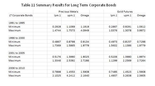
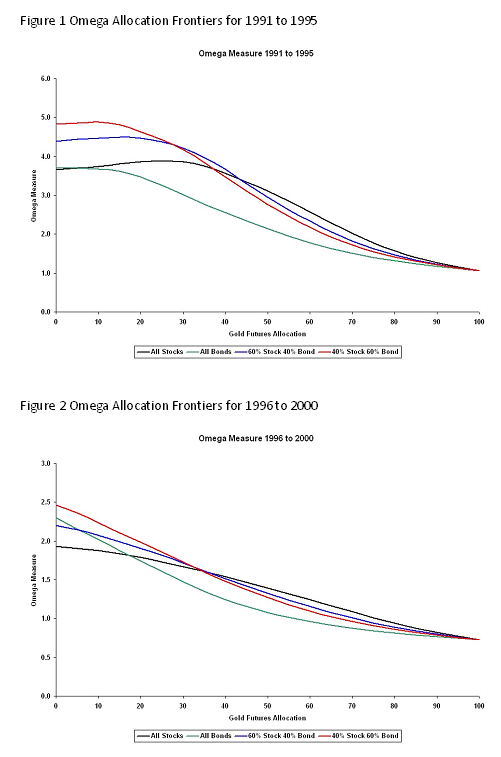
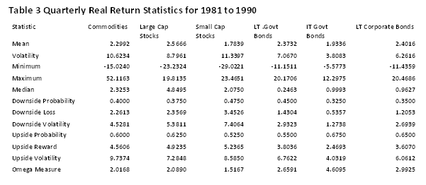
We now look at two algorithmic traders. Mr. Rip Van Winkle has a program in which the equal weights are reset and the end of each year and we refer to his strategy as the Annual Re-balance. The second trader is Mr. Luna Plena and he resets the equal weights at the end of each month. We refer to his strategy as the Monthly Re-balance. Tables 3 through 6 show our standard summary statistics for the two strategies compared to our passive end of month re-balancing and the two underlying commodities. There is evidence to suggest that more frequent trading seems to add value over a simple month end re-balance.

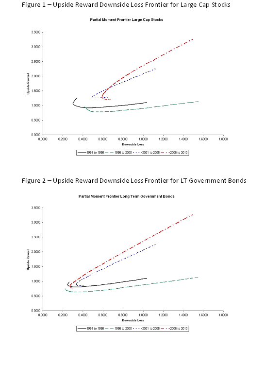
Figures 1 through 4 are the acid test by looking a cumulative wealth starting at $100 and going through the end of each five year time period. Looks like dynamic trading works except in Figure 4. The extreme drop began in 2007 as the full effect of market turbulence took hold.

With care in the design and implementation, algorithmic trading can provide superior performance results. A caveat is that we did not include trading costs, which if not carefully managed, can take away from the benefits of algorithmic trading.


Click to Enlarge


Sponsored by: EMA Softech


Wednesday, December 14, 2011

Risk Alchemy with Precious Metals

By Fred Novomestky, Ph.D

Alchemy is one of those magical words that bring to mind the workings of a medieval magician or sorcerer. They would transform base metal to gold. Another interpretation of the word is “the process or power of transforming something common into something special.” In the blog Managing Downside Loss with Gold, we used the Upside Reward Downside Loss Frontier chart to both highlight the potential value of gold to both enhance reward but minimize downside loss. We also explored allocations to individual asset classes and portfolios that resulted in minimum downside loss. Let’s see how well we can transform into something special the downside loss and upside reward of portfolios of financial assets by including precious metals or gold by itself.

We maintain the same empirical framework that has been used in the past several blogs. We observe the performance results of four distinct portfolios: all stocks, all bonds, 40% stocks 60% bonds and 60% stocks and 40% bonds. These portfolios are analyzed over four non-overlapping time periods: 1991 to 1995, 1996 to 2000, 2001 to 2005 and 2006 to 2010. The basic portfolios are assumed to be passively rebalanced to the corresponding asset mixes at the beginning of each month. Tables 1 through 4 summarize the return statistics for each of the portfolios and precious metals and for each time period. The reader should refer to the blog Portfolio Strategy and Gold [include a link for this blog] to see the corresponding statistics for gold futures. The investor should be concerned about the observation that the downside loss for precious metals has been greater than most portfolios across most of the time periods.

The blog Blending Financial Assets and Precious Metals has shown that the weak or negative correlation of financial assets with precious metals can be the magic ingredient for transforming downside loss. When you look at the correlation coefficients in Table 5 that compare and contrast the correlation of the portfolio returns with both gold alone and precious metals, you get a sense of how dynamic these relationships are. Furthermore, with gold and silver equally weighted as we recommended in All That Glitters Is Not Gold, the resultant mix appears to be more correlated with the asset portfolios than gold alone.

Figures 1 through 4 present the upside reward to downside loss efficient frontiers for the four portfolios. The minimum downside loss portfolio changes over time with corresponding exposure to gold and precious metal summarized in Tables 6 and 7, respectively. The first piece of alchemy is the reduction of downside loss when asset portfolios are combined with gold and precious metals. Tables 8 and 9 summarize the effect. For example, the downside loss in Table 8 for All Stock without gold is the measure for the portfolio with 0% exposure to gold. The downside loss for All Stock with gold is the measure for the minimum downside loss portfolio. In all cases downside loss for a portfolio with gold or precious metal is less than or no worse than the downside loss for the portfolio with financial assets alone. Yet, it is hard to see the difference between gold alone and precious metals.

Let’s take a look at the effect of gold and precious metals on getting the best upside reward. Tables 10 and 11 show the allocations to gold and precious metals, respectively, that are associated with the maximum upside reward. It is disappointing to see that you either have no exposure to these commodities or convert the entire portfolio to a commodities portfolio. The problem is the static nature of the asset allocation process with the passive rebalancing to fixed exposures to financial assets and the commodities. Commodity trading advisors (CTA’s) are adept at dynamically adjusting the exposure to commodities to get the greatest value to investors. Tables 12 and 13 show the effect of our passive strategy with upside reward improving with or without the use of commodities in a rather naïve and unrealistic manner.

We’ve seen how gold and futures can transform conventional downside risk in financial asset portfolios into something special. To get the best improvement in upside reward requires a more dynamic investment strategy.


Click to Enlarge


Sponsored by: EMA Softech

Monday, November 28, 2011

Blending Financial Assets and Precious Metals

By Fred Novomestky, Ph.D

In my previous blog, All That Glitters Is Not Gold, I looked at the benefits and issues of long term investments in other precious metal commodities, namely, silver and platinum. The benefits of diversification were noticeable. The platinum futures market, however, is not sufficiently large to make it accessible to investors in any meaningful manner. We found on the basis of the omega measure that the Dow Jones UBS Precious Metals Index fared somewhat better than our equal weighted portfolio of gold and silver in two time periods and worst in the other two time periods. In this blog we will see what happens when you combine precious metals with financial assets using the equally weighted portfolio.

We maintain consistency with the previous blogs by using the same four, five-year time periods of 1991 to 1995, 1996 to 2000, 2001 to 2005 and 2006 to 2010. The financial assets are large capitalization stocks, small capitalization stocks, long term government bonds, intermediate term government bonds and long term corporate bonds as computed by Ibbotson and Associates. Tables 1 to 4 contain monthly return statistics for the five asset classes, precious metals and gold futures. Gold futures were contrasted to financial assets in the blog Asset Allocation and Gold. The statistics are mean, volatility (i.e. standard deviation of returns), minimum, maximum, downside probability, downside loss downside volatility, upside probability, upside reward, upside volatility and omega measure. The upside and downside statistics are partial moments which are introduced in the blog Partial Moments – the Up and Down of Performance and Risk. Omega measure is the ratio of upside reward to downside loss.

On the basis of omega measure, most financial assets outperform precious metals and gold futures. The exception is 2006 to 2010. One has to ask if it pays to combine these commodities with financial assets. Tables 5 and 6 provide a partial answer. Table 5 presents the correlation of precious metals and financial assets while Table 6 highlights the correlations of gold with financial assets. Generally speaking, both gold and precious metals have weak positive or negative correlations with financial assets. Precious metals, as a portfolio, tend to have even more negative or weaker positive correlations. This provides an opportunity to further diversify risk.

In Asset Allocation and Gold we presented omega frontier charts that show the effect of different mixes of gold and financial assets on the omega measure. These charts are not used here as they tend to have the same appearance and do not reveal information on impact of using precious metals instead of gold as a diversifying investment. Instead, we introduce a new style of analysis in Tables 7 to 11. Each table corresponds to a different financial asset. The time periods are groups of rows with Minimum and Maximum values. There are two groups of columns, one for Precious Metals and the other for Gold Futures. Each group consists of lpm.1 (downside loss), upm.1 (upside reward) and omega. Each value is associated with a portfolio of financial asset and the commodity (gold futures or precious metals). For example, the minimum and maximum upside reward for large cap stocks in Table 7 and for the time period 1991 to 1995 are 1.2799 and 1.9617 for precious metals and 0.9796 and 1.9617 for gold futures. The minimum values are the worst case outcomes for upside reward and the maximum values are the best case outcomes. Notice that precious metals had the greatest worst case outcome when compared to gold whereas both choices had the same best case outcome. In this case, an investor would prefer precious metals as a diversifying investment combined with large capitalization stocks.

If you look at best and worst case outcomes for downside loss, you would probably not want to consider blending silver with gold. The minimum values for downside loss are associated with the minimum loss portfolio as we discussed in the blog Managing Downside Loss with Gold. On the other hand, if you look at the omega measure, a risk adjusted measure of performance; the blend is clearly the best choice for almost all asset classes and time periods. I think that most investors would rather err on the side of more diversification rather than less when dabbling in commodities.


Click to Enlarge


Sponsored by: EMA Softech

Thursday, November 3, 2011

All That Glitters Is Not Gold

By Fred Novomestky, Ph.D

The past several blogs have been devoted to a thoughtful analysis of the inclusion of gold along with financial assets. Using partial moments analysis, it is clear that gold exposure over longer periods of time can be reward enhancing and risk reducing. Gold is but one of several precious metals that commodity trading advisors (CTA’s) incorporate in their managed futures accounts. We take a look at two other precious metals in this blog, namely, silver and platinum.

Gold and silver play a major role in the Dow Jones UBS Commodity Index. The exposures to the various commodities in the index are reset annually. For 2011, the exposure to gold is 10.45% and the exposure to silver is 3.29%. A precious metals sub-index is computed by Dow Jones UBS for gold, silver and platinum. In addition, there is a sub-index for gold and silver. Each of these indices are based on a fully margined commodity futures contract position for the precious metals.

Let us begin by looking at return statistics for the three commodities. Table 1 summarizes the return statistics for gold, silver and platinum. We provide the traditional statistical measures for the monthly total return of these commodities as well as the upper and lower partial moments defined in our recent blog, Partial Moments – the Up and Down of Performance and Risk. We consider four, five-year time periods as we have been doing in the past several blogs, namely, 1991 to 1995, 1996 to 2000, 2001 to 2005, and 2006 to 2010. Silver has had a higher mean return when compared to gold in each of these time periods. It has also experienced more volatility than gold or platinum. Platinum has outperformed gold in three of four time periods. Using a zero return target, platinum has the highest upside probability and lowest downside probability of the three commodities.

In general, precious metal prices tend to move in comparable directions. Table 2 presents the correlations between pairs of commodities for each of the time periods. From a statistical point of view, these numbers are meaningful and substantially positive. These correlations are dynamic and change over time.

While the mean return statistics are interesting, an investor is also interested in seeing the financial rewards from investments in each of the precious metals. Figures 1 through 4 present the cumulative wealth indices for each commodity and each time period. Each curve assumes that the investor allocates 100 domestic currency units (e.g. U.S. dollars) in a commodity. At the end of each month, the entire value determined by that month’s return is reinvested for the next month. Except for 2001 to 2005, the investor would have greater wealth at the end of the five year period by an investment in silver than a similar investment in gold. Platinum is a dominant investment relative to gold except in the 2006 to 2010. With a worst case monthly return of -31.24% in 2008 along with three other significant negative months in 2008 and one in 2010, platinum underperformed both gold and silver.

The commodity trading advisor would combine multiple commodities in a managed futures account to gain the benefits of diversification. Table 3 provides comparable summary return statistics for three portfolios. The first portfolio is the Dow Jones UBS Precious Metals index which combines gold and silver with weights derived from the weights for the individual commodities from the entire index. The second portfolio equally weights gold and silver in each month of a time period. The third portfolio equally weights gold, silver and platinum in each month. Except for the 2006 to 2010 time period, the third portfolio has the highest upside probability and lowest downside probability. Equal weighted portfolios tend to outperform the Dow Jones UBS Index. Figures 5 through 8 show the cumulative wealth indices for the portfolio in each of the time periods and Table 4 summarizes the cumulative results including annualized returns and volatilities. The poor results in 2006 to 2010 for the equal weighted portfolio of three precious metals are due to the adverse performance in 2008 and 2010 for platinum highlighted above. All of these portfolios have volatilities that are normally associated with equity portfolios.

The long term investor can benefit from a strategic exposure to gold and other precious metals in their portfolio. Platinum has potentially attractive benefits. Unfortunately, open interest in the futures market is highest for gold and silver. This limits the potential for using platinum making it one of highest fruits in the market apple tree.


Click to Enlarge


Sponsored by: EMA Softech

Friday, October 14, 2011

Managing Downside Loss with Gold

By Fred Novomestky, Ph.D

The current wide swings and volatility in both the financial and commodity markets continue to provide opportunities for and challenges to the investor. Gold prices recently dropped dramatically only to be followed by increases as the equity markets have moved upwards. My previous blogs show how adding gold to financial assets and portfolios of these assets over long time periods can result in significant rewards. Well, it turns out that the inclusion of gold in portfolios can help reduce downside losses as well.

In the blog Partial Moments – the Up and Down of Performance and Risk we showed charts that presented upside reward and downside volatility for each of several asset classes. These charts were compared to the traditional investment opportunity sets. While downside volatility is a more interesting choice for volatility than traditional return volatility, downside loss, the lower partial moment of order 1, is a more compelling measure of the pain or loss to the investor when investment results fall below the target level. A more useful chart is upside reward versus downside loss. We will call this the upside reward downside loss frontier.

Figures 1 and 2 show these frontiers for large capitalization stocks and long term government bonds combined with gold futures, respectively. Notice that each chart has four curves, one for each of four time periods. The time periods are 1991 to 1995, 1996 to 2000, 2001 to 2005 and 2006 to 2010. Each curve shows how upside reward and downside loss varies as you change the allocation between the asset class and gold futures. The data used to construct these curves are found in Tables 1 and 2. There are pairs of columns for each time period. The column labeled lpm.1 is the downside loss measure and the column labeled upm.1 is the upside reward measure. The target level is 0 implying an aversion to negative returns.

Notice that as you follow each curve there is, in most cases, a point on the curve that is the leftmost point. This is the portfolio with the smallest downside loss. For many investors this is becoming an attractive investment strategy. Finding the allocation to gold futures that result in the minimum downside loss portfolio is a challenging portfolio design problem but we will illustrate a way to get a reasonable answer.

Let’s focus on Table 1 and the pair of columns for 1991 to 1995. Notice that the lpm.1 values decrease as you increase the allocation to gold futures until you reach the minimum value. Thereafter the values increase. At the bottom of the column is the minimum value of all the numbers in the column which is 0.3017. All you have to do is locate that value in the column that corresponds to the minimum and highlight it. This value is highlighted and corresponds to a 15% allocation to gold futures. The similarly computed numbers for the other times are highlighted for the other time periods.

Table 3 summarizes the determination of gold allocations that result in minimum downside loss for each of the asset classes we have been using in the recent blogs and for each of time periods. Notice that except for small stocks, no asset class in the 1996 to 2000 time period benefited from a loss minimization through an exposure to gold. I invite you to review the previous blogs that summarize asset class return statistics for this time period. Another important result is that equity asset classes require a higher exposure to gold to achieve the minimum downside loss than the fixed income asset classes.

The blog Portfolio Strategy and Gold discussed the effect of including gold futures as part of the allocation to four different portfolios. The portfolio are (1) all stocks, (2) all bonds, (3) 40% stocks and 60% bonds and (4) 60% stocks and 40% bonds. Figures 3 to 6 present the corresponding upper reward downside loss frontiers for these portfolios combined with gold futures and each time period. The inclusion of gold futures in virtually all portfolios and all time periods has the benefit of reducing the prospects of downside loss. Table 4 summarized the minimum downside loss allocations to gold futures for these portfolios and time periods. Once again, portfolios with higher allocations to equities require more gold exposure to reduce downside loss. The 40% stock 60% bond portfolio is the equal weighted portfolio of all asset classes and hence the perfectly diversified portfolio. This is the portfolio with a 20% allocation to gold futures.

The exposure to gold can provide attractive returns and risk management as well. The challenge for investors is to decide whether they have the appetite for permanent large commitments to gold in their portfolios. We have already looked at the use of a variety of commodities in portfolios to protect purchasing power. We return to this asset classes to view the tradeoff of upside reward and downside loss in the next blog.


Click to Enlarge


Sponsored by: EMA Softech

Wednesday, September 21, 2011

Portfolio Strategy and Gold

By Fred Novomestky, Ph.D.

The blog on Asset Allocation and Gold set the stage for encouraging investors to consider the inclusion of gold as a strategic investment. I want to make it clear that there maybe a better alternative to just investing in gold and will get back to this point in the future.

We want to expand on the notion of allocation to gold futures by considering the effect of including gold futures in four illustrative portfolios. The component asset classes are U.S. large cap stocks, small cap stocks, long term government bonds, intermediate term government bonds and long term corporate bonds. We combine the two equity asset classes into a single stock sub-portfolio with perfect diversification as we described in the blog Asset Allocation, Diversification Now Passé?. We defined perfect diversification as an equally weighted portfolio in contrast to perfect concentration in which almost all the invested capital is allocation to one asset. The three bond asset classes are also combined into an equally weighted, perfectly diversified sub-portfolio.

The first of the portfolios consists of a 100% allocation to the stock sub-portfolio and we call it all stock. The second portfolio is called the all bond portfolio and consists of a 100% allocation to the bond sub-portfolio. The third portfolio consists of a 60% allocation to the stock sub-portfolio and a 40% allocation to the bond sub-portfolio. The fourth portfolio has a 40% allocation to the stock sub-portfolio and a 60% allocation to the bond sub-portfolio. A simple arithmetic calculation will reveal that there is a 20% allocation to each of the five asset classes that make up the portfolio and therefore this portfolio has perfect diversification.

To maintain consistency with our previous analysis, we use monthly returns for the asset classes to compute the monthly returns of the four portfolios. Each portfolio is assumed to re-balance at the beginning of each month to the same weights that characterize the portfolio. The entire time period January 1991 to December 2010 is divided into four time periods: 1991 to 1995, 1996 to 2000, 2001 to 2005 and 2006 to 2010. The summary return statistics for each portfolio and gold futures are found in Tables 1 to 4. Except for the 2006 to 2010 time period, the 40% stock 60% bond portfolio has the highest omega measure showing the value of perfect diversification.

We use the same proxy for gold futures investment as in the previous blog, namely, the Dow Jones UBS gold futures total return index. Table 5 shows the correlation of gold futures to each of the portfolios. In 1991 to 1995, all the correlations were negative in the subsequent time periods, there were positive but not necessarily significant.

Figures 1 to 4 highlight the omega measure over a range of allocations to gold from 0% (the traditional asset class investor) to 100% (the gold commodity trading advisor) for each of the four time periods. All portfolios in all time periods benefit from the incorporation of gold futures. An allocation to gold futures between 10% and 40% shows the 40% stock 60% bond having the best lower partial moment risk adjusted performance.

What is interesting to note is that as is the case with asset classes the investor benefits from the inclusion of gold in their portfolio. In the next blog we continue with our analysis of gold investing in pursuit of the portfolio with minimum downside loss.


Click to Enlarge


Sponsored by: EMA Softech


Friday, September 9, 2011

Asset Allocation and Gold

By Fred Novomestky, Ph.D.


In my previous blog, The Prudent Investor and Gold, I looked at the long term behavior of traditional asset class returns and the gold spot returns. We established that the flat-currency price of gold will by flat or decline when real returns on assets are high. Conversely, when real returns have been low or stagnant, then gold has been strong.

We also found a surprise in that these correlations are not really meaningful. In fact, for all intent and purposes, gold spot returns are uncorrelated with the returns of U.S. stocks and bonds. This is still good news for the investor.

At a time when investors are seeing dizzying movements in gold prices, the prudent investor would like to know the answer to three questions. First, should I have a strategic exposure to gold in my portfolio? Second, what are reasonable allocations to gold? Finally, how can invest in gold? In this blog, we will try to answer the first two questions using partial moment analysis that was introduced in the blog, Partial Moments – the Up and Down of Performance and Risk . Let’s tackle the third question first.

Currently, there are three ways to create an exposure to gold price movements in a portfolio. A traditional approach is to invest in a mutual fund of equity shares for those companies that have earnings linked to gold price movements. These may be companies that mine gold or companies that created products made of gold. Academics and practitioners have found this a poor proxy for gold price movements because their earnings may be affected by economic factors other than gold. A second approach is to invest in gold futures contracts that are fully margined by cash in a risk free portfolio. This means, for example, a $10,000,000 exposure to the most liquid gold futures contracts is collateralized with a $10,000,000 margin account. The investor has to manage variation margin and the roll of futures contract before the likelihood of taking delivery of actual gold. Finally, the investor can use an exchanged traded fund like the iShares Gold Fund.

We will use the second approach and represent the performance of such a trading strategy with the daily returns of the Dow Jones UBS Commodity Index component for gold futures. The daily return series carefully takes into account the full margining and control roll. The data used for the analytical portion of this blog can be found on http://www.djindexes.com.

We derive monthly returns of gold futures that are then compared to the monthly returns of traditional U.S. capital market investments in U.S. large and small cap stocks, long and intermediate term government bonds and long term corporate bonds. In contrast to the previous blog, we look at four time periods each of five calendar years in duration. The time periods are 1991 to 1995, 1996 to 2000, 2001 to 2005 and 2006 to 2010. Tables 1 to 4 provide the summary statistics for these asset class, spot gold and gold futures for each of these time periods. The differences you see between gold spot and gold futures are due to the characteristics of futures pricing and contract rolls relative to the simple London pricing fixing of spot gold prices. Furthermore, from Table 5, the correlation between gold spot and futures returns are virtually one indicating that the futures trading in gold is an excellent proxy for spot trading.

The next question is how much to allocation to gold for each of the traditional capital market investments described above. We use the omega measure that defined in the blog, The Prudent Investor and Gold. For a given target level, it is the upside reward divided by the downside loss and provides a target return basis of defining risk adjusted returns very much like Sharpe ratios. We now consider simple portfolios that combine each of the five traditional asset classes with an exposure to gold futures. For each time horizon and gold futures allocation, we compute the returns of a portfolio that is rebalanced monthly to begin each month with the same gold allocation. The omega measure is then computed for each portfolio.

Figures 1 to 5 highlight the omega measure over a range of allocations to gold from 0% (the traditional asset class investor) to 100% (the gold commodity trading advisor) for each of the asset classes and for each of the four time periods. The optimal allocation to gold futures is that exposure that produces the highest omega measure. For U.S. stocks there is such a value except for the 1996 to 2000 time period in which gold is not a good diversifying investment. For fixed income investments, the benefit of gold allocation is noticeable since 2001.

What is interesting to note is that generally speaking across all asset classes and time periods the investor benefits from the inclusion of gold in their portfolio from as little as 10% (very conservative) to 40% (very aggressive). In the next blog we continue with our analysis of gold investing.

Click to Enlarge


Sponsored by: EMA Softech

Tuesday, August 9, 2011

The Prudent Investor and Gold

By Fred Novomestky, Ph.D.


There has been considerable interest, discussion and debate on investing in gold since the recessionary period that started in 2008. Regular television viewers have been barraged with advertisements saying that it has never been a better time to move a portion or all of our assets into gold investments. The current downgrade of U.S. debt by Standard & Poors has fueled aggressive trading in the gold spot and futures markets.

The article by John Dizzard in the May 9, 2011 edition of the Financial Times Monthly Review on the Fund Management Industry has an attention grabbing title, “Reasons not to fondle your gold”. He carefully reminds the reader that gold is “real” money. Real money, un-invested in any opportunity, does not earn any return. We are talking here about gold as precious metal or hard currency. Warren Buffet was quoted as saying that if you owned all the gold in the world it would not earn anything for you. On the other hand, if you owned all the farmland in the U.S. and several large oil companies you could earn something, the “stuff”.

John Dizzard references a study that was performed by Larry Summers and Robert Barksy, Gibson’s Paradox and the Gold Standard, in 1985 [see the article at http://www.gata.org/files/gibson.pdf ]. The authors found a “Strong co-movement between the inverse relative price of gold and the real interest rates ….”. That is, if real interest rates on bonds or equity yields are high, holders of money have more incentive to use their cash to buy assets.

In a multi-year investment strategy, the flat-currency price of gold will by flat or decline when real returns on assets are high. Conversely, when real returns have been low or stagnant, then gold has been strong.

The author closes by saying that in the current economic environment gold is a useful capital preserver. Over decades staying in cash rather than earning assets is fruitless.

We are going to do a simple test of the research by Summers and Barksy using the quarterly real returns for the five equity and fixed income asset classes that were used in the blog on Purchasing Power and Commodities [provide a link]. We consider four (4) ten year time periods: 1971 to 1980, 1981 to 1990, 1991 to 2000, and 2001 to 2010.

The gold prices used for the empirical analysis were downloaded from the web site of the World Gold Council, http://www.gold.org. The gold price used on this site is the London PM fix. This price is quoted in US dollars. Where the gold price is presented in currencies other than the US dollar, it is converted into the local currency unit using the foreign exchange rate closing price on the same day...

Economists and statisticians have used a measure called correlation to quantify the statistical dependency between pairs of financial variables. The correlation measure takes on values between -1 and +1. Our financial variables are quarterly growth rates in the spot price of gold and the real returns of U.S. stocks and bonds. When the correlation between two variables is close to +1, we say that an increase in one variable is most often accompanied by an increase in the other variable. At the other extreme, when the correlation is close to -1, then an increase in one variable is most likely accompanied by a decrease in the other variable.

Tables 1 to 4 summarize the estimated correlations between gold and each of the financial asset returns over the four time periods. The column of interest is the first column and, specifically, the values below the first row which are highlighted in bold. These represent the correlation between gold growth rates and the real returns of the assets. The theory as set forth by Summer and Barksy would suggest negative correlations with stock real returns and positive correlation with bond returns (similar to the negative correlation with real interest rates).

There are several observations that are noteworthy. The first is that, in general, there is a slight negative correlation between gold returns and real returns of stocks but only in three of four ten year periods. The second observation is the general positive correlation between gold returns and bond real returns but not in all ten year periods. It is also interesting to note that the magnitude of the correlations between gold and financial assets is small. The statistician would run a test to determine if these correlations are really different from zero. The report would indicate that they are not really different from zero as one would expect in the correlation between risky assets and a risk-less investment.

The long term investor can benefit from a strategic exposure to gold in their portfolio just as cash is a powerful diversifying instrument. Then again, gold is just real money.


Click to Enlarge


Sponsored by: EMA Softech

Wednesday, August 3, 2011

Purchasing Power and Commodities

By Fred Novomestky, Ph.D.


It is difficult to think beyond the crisis we have been facing as a deal is made in Congress to increase the debt ceiling. Conflicting economists predict either a recession worse than the one in 2008, or a continuation of sluggish economic growth. The baby boomers are faced with the problem of how to safeguard the assets they have, and somehow protect themselves from running out of money before their time.

This blog takes a look at how asset classes have fared over the forty year period 1971 to 2010 by using partial moments to quantify the likelihood that the purchasing power of these asset classes is protected and to what extent. It is helpful to see how annual inflation has changed over this time. Figures 1 to 4 show what happened. OPEC I and OPEC II occurred in 1974 and 1980. Investors at that time enjoyed double digit interest rates in their CD’s but also had to deal with double digit inflation. Since then, we have been enjoying inflation rates between 3% and 4%. In 2008, the inflation rate was just below zero.

Economists measure purchasing power by calculating the real return of investments. While we use the textbook formula for computing real returns, they are often approximated by subtracting the inflation rate for a given time period from the nominal or total returns of an investment. To protect purchasing power, the investor wants real returns that are greater than zero as often as possible (ideally all the time). If we apply the partial moment methodology, then the target return for real returns should be zero.

Table 1 illustrates how to evaluate the lower and upper partial moments for the real returns of commodities. They are represented by the Goldman Sachs Commodity Index using the quarterly returns and inflation rates over the time period 2006 to 2010. The downside loss was 6.0891% while the upside reward was 5.6120%. Con Keating and William Shadwick of The Finance Development Centre in London, developed a useful risk adjusted measure to rank investments in a partial moment context. They call it the “omega measure”, and it is defined as the ratio of upside reward (upper partial moment of order 1) to downside loss (lower partial moment of order 1). For commodities, the omega measure was 0.9217.

Tables 2 through 5 provide both traditional statistical moments, as well as the partial moments for six asset classes. The asset classes are commodities, large cap stocks, small cap stocks long term government bonds, intermediate term government bonds, and long term corporate bonds. Table 2 contains the statistics based on quarterly real returns for the time period 1971 to 1980. Table 3 contains the statistics for the time period 1981 to 1990, and so forth. In the periods of hyperinflation such as 1971 to 1980, commodities clearly provided superior risk adjusted performance as expressed by the omega measure. In the periods closer to the long run average, which for the forty year period was 4.41%, many other asset classes performed better than commodities. Stressful time periods such as 2001 to 2010 seem to make all investments have the same likelihood of having positive real returns. A portfolio of these investments might have led to better risk adjusted performance.

It is imprudent and dangerous for an investor to place all their capital in one asset class. We have discussed the benefits of diversification in a previous blog. The next blog looks at how a core exposure to commodities over long time periods may actually be beneficial to investors interested in protecting purchasing power.

Click To Enlarge


Table 1 Real Return Partial Moments Example


Sponsored by: EMA Softech

Wednesday, July 6, 2011

Peer Group Analysis with Partial Moments

By Fred Novomestky, Ph.D.


The evaluation of active portfolio management relative to a benchmark is one of two common approaches to portfolio performance analysis. The blog Active Management Evaluation with Partial Moments shows how to merge the well known measures of active return and asymmetric measures of reward and risk to gain additional points of view on manager performance

Many organizations that offer performance evaluation services on traditional investment funds also offer peer group comparison. Carl Bacon, in his book Practical Portfolio Performance Measurement and Attribution, offers his views on the pros and cons of peer groups which he defines as collections of competitor portfolios of similar strategies grouped together to present comparable statistics. A benefit of peer groups is that the evaluation of nominal returns as opposed to active returns is more appropriate because it is more appropriate than benchmark comparison. In our example we show that it is also valuable for comparing the active rewards of investment managers with similar strategies. On the negative side, peer groups can suffer from “survivorship bias” in which poor performing portfolios are either closed or removed from the universe. In our example, we consider the current universe of managers only to derive the universe statistics.

The percentile rank of a performance measure for the managers in a universe is a consistent way of comparing a manager’s result with the universe. For example, the universe of Multi-Cap Core Fund managers consists of over 700 funds as of March 2011. Let us say we are interested in the percentile rank of a manager’s average active return over a three year period ending March 2011. We begin by computing this performance measure for all of the managers provided they have three years of reported performance. Those that do not have the required return history are excluded from the analysis. The remaining results are reordered in ascending order so that the first observation is the smallest three year average active return and the last is the largest average active return. The 25th percentile value which is called a quantile by statisticians is that number such that 25% of the results are less than this value. The median quantile is that number such that half of the results are less than this value. The 75th percentile quantile is that number such that 75% of the results are less than this value. Typically the minimum and maximum values for a performance measure are also reported. These quantiles define the league table against which individual managers are assessed.

The result for a particular manager can be ranked against the values computed for the universe to obtain a percent rank for the manager. The performance measurement industry has adopted a different view of ranking from the one used in other fields. The percentile rank is a number between 0% and 100% with 0% being the top-ranked portfolio and 100% being the bottom-ranked portfolio. In the following example, we will stick with the statistician’s way and you can make the translation.

The universe comparison of average return and upper partial moment of order 1 constructs ranks of rewards in which higher rewards earn a higher rank. The universe comparison of lower partial moment of order 1 defines what actuaries in the insurance industry call loss distributions. A smaller loss deserves a higher rank than a greater loss.

We use the same Multi-Cap Core Fund manager from the previous blog with reported returns starting in January 1972. Specifically, we examine the realized returns for the 10 year period ending March 2011. Table 1 shows the universe quantiles for the 10 time periods, the corresponding fund values and percentile ranks for the nominal return average. Notice that our illustrative fund had above median performance for the one through four year holding periods. The longer the holding period, the less attractive the fund is. A similar situation occurs when you look at the average active returns found in Table 2. You want to be in the highest percentile in the league table.

Table 3 presents the peer group analysis of the active return downside loss. Remember that these are loss rankings. As such you want to be in the lowest percentiles of the league table and our illustrative fund seems to fare well in this performance measure. Table 4 completes the illustration with the peer group analysis of active return upside reward and except for the three year holding period the manager’s relative performance in peer group is disappointing.

Once again, there is more to be learned about a manager’s return history by making use of partial moments. The investor should ask the provider of portfolio performance analysis if they can offer partial moments in their service. This is not a fashion but rather it is a perspective that should always be considered by investors.

Click To Enlarge


Sponsored by: EMA Softech

Tuesday, June 28, 2011

Active Management Evaluation with Partial Moments

By Fred Novomestky, Ph.D.

In my previous blog, I showed how different the world of investment return and risk when viewed through the prism of partial moments. Your personal target determines the performance of capital markets and the efficient frontier from which you select desirable portfolios.

Services that offer performance evaluation services on traditional investment funds such as mutual funds have traditionally focused on distilling reported performance history into statistical measures such as average return, the volatility or standard deviation of historical returns, systematic risk or market beta, and, in the case of U.S. equity funds, style analysis derived from exposures to multiple common factors such as market, size, book to market and momentum. It is difficult to see the extent that a manager’s performance is dominated by upside or downside reward and risk.

We begin with two simple examples of evaluating a manager’s performance relative to a zero target level. The manager selected is a Multi-Cap Core Fund manager with reported returns starting in January 1972. Specifically, we examine the realized returns for the 24 month period ending March 2011. Table 1 shows the standard and partial moments for the nominal returns. The average monthly return was 2.5621% with a realized volatility of 4.6678%. The columns labeled LPM 0, LPM 1 and LPM 2 correspond to downside probability, downside loss and downside volatility. The columns labeled UPM 0, UPM 1 and UPM 2 are associated with upside probability, upside reward and upside volatility On the basis of nominal returns, the investor would be pleased to see that the upside probability of 0.7917 overwhelms the downside probability of 0.2083 and that the upside reward of exceeds the downside loss by a factor of three. There is also more upside volatility than downside volatility.

A different picture emerges when you look at the active returns of the manager relative to its benchmark. I have taken the Russell 3000 to be the benchmark for the manager and Table 2. The active fund on the basis of average return performed like the benchmark. Looking at upside and downside volatility, the active reward or loss is about the same that you would get by flipping a fair coin with similar amounts and rewards. I suspect that, given this information, the prospective investor might be a bit concerned about consistency of active returns from this manager.


Table 1 Nominal Return Moments Click to enlarge


Table 2 Active Return Moments Click to enlarge


Sponsored by: EMA Softech

Friday, May 20, 2011

Partial Moments – the Up and Down of Performance and Risk

By Fred Novomestky, Ph.D.

The design and analysis of investment portfolios were for ever changed with the development of the Capital Asset Pricing Model (CAPM) and Modern Portfolio Theory (MPT). Since the early 1970’s, academics, consultants and investors have used statistics to quantify expected or realized reward and the variability or dispersion of these rewards. Investment performance attribution models built using the statistical technique of linear regression are widely used to measure the potential sources of investment performance for portfolio managers. Services such as Morningstar, Lipper Reuters and eVestments report statistics beautifully packaged to give an investor the impression that there is one size that fits the needs of all investors.

We all know that different investors have different aspirations for investment rewards and tolerance for potential loses. The efficient frontier from MPT is an attempt to provide different portfolios that define for all investors the possible tradeoffs of expected reward and volatility of those rewards. Is there any way that an investor can impose his or her target return goals and say that the real tradeoff is by seeking rewards above this target and controlling or minimizing the variability of returns below the target?

Economists and statisticians in the 1980’s look for a way of expressing these views. A principal result has been the concept of partial moments as asymmetric counterparts to the mean and variance of returns. Partial moments are sometimes referred to one-sided moments. All partial moments have a target or threshold return r and an integer degree m. Bernd Scherer in his book Portfolio Construction & Risk Budgeting offers a thoughtful discussion of partial moments. We will distill the concepts he presents into illustrations to bring to light the effect of the recent credit crisis by measuring these moments in the time period 2005 to 2010.

Target returns depend on the investor’s objective. A zero return target is suitable for investors seeking capital preservation. The inflation rate is appropriate for endowments and foundations seeking to protect purchasing power. Return targets that are moving benchmarks are appropriate for investors with relative performance objectives.

The lower partial moment (LPM) of degree m measures the average value for the difference between the target return and investment return raised to the power m and for the returns below the target return. If the degree is 0, it is called the short fall or downside probability of underperforming the target return. If the degree is 1, the LPM is called the target shortfall and it is the mean loss below the target return. If the degree is 2, the LPM is called the target lower variance and it measures the variability or dispersion of returns below the target return. The square root of this target lower variance is a lower standard deviation.

The upper partial moment (UPM) of degree m measures the average value for the difference between the investment return and the target return raised to the power m and for the returns above the target return. The degree 0 UPM is called the upside probability of outperforming the target return. If the degree is 1, the UPM is called the target upside and it is average outperformance of the investment over the target return. If the degree is 2, the UPM is called the target upper variance and it measures the variability of returns above the target return. The square root of this target upper variance is an upper standard deviation.

We illustrate the calculate of partial moments using the quarterly returns for long term U.S. government bonds and U.S. large stocks derived from the monthly returns in the Ibbotson and Associates database for the time period 1Q 2005 through 4 Q 2010. Tables 1 and 2 summarize the returns. The standard symmetric first moments are the mean returns which for the government bonds and large stocks are 1.64% and 1.07%, respectively. The corresponding variances of returns for these asset classes are 0.004298 and 0.008062. The associated standard deviations are 6.56% and 8.98%. This time period is characterized as one in which government bonds outperformed stocks while the returns of stocks was noticeably more volatile than those of bonds. The two assets were also strongly negatively correlated with a correlation coefficient of -0.5356.

Tables 3 and 4 illustrate the calculation of LPM and UPM for degrees 0, 1, and 2 for government bonds and large stocks, respectively. The target return is 1%. Each table is organized into two sets of four columns, one set for LPM and the other set for UPM. For the LPM set, the column labeled Indicator value is 1 if the corresponding quarterly return is less than the target return and zero otherwise. For the UPM set, the Indicator value is 1 if the corresponding quarterly return is greater than the target return and zero otherwise. The Moment 0 column contains the product of the Indicator column and the Target Return minus the Asset Class return raised to the power 0. The Moment 1 column contains the product of the Indicator column and the Target Return minus the Asset Class return. The Moment 2 column contains the product of the Indicator column and the Target Return minus the Asset Class return raised to the power 2. The row labeled Moments has the average values in each of the Moment columns. The square root of the Moment 2 column average is the lower and upper standard deviation.

Figure 1 shows how upper mean and lower standard deviation change when you vary the target return from 0% to 5%. Note that at all target return levels, large stocks had higher levels of lower standard deviations than government bonds with comparable upper mean returns.

Traditional MPT looks to compare the mean returns and volatilities of portfolios. Figure 2 shows a typical investment opportunity set obtained by varying the exposure of stocks from 0% to 100% and bonds from 100% to 0% respectively. The minimum risk portfolio that assumedly would be held by all investors would be that with a 39.92% exposure to stocks. Figure 3 shows a dramatically different view of the opportunity sets when the tradeoff is between upper mean and lower standard deviation for the different target returns. The minimum lower standard deviation in this simple case is fairly close for all target returns although at higher target returns the exposure to stocks is greater.

The story that emerges when you look at investment opportunities from a partial moments point of view is that there is no one size fit all solution to the investment problem. Investors need to give careful consideration to selecting target returns in light of their investment objectives.

Click on the figures below for larger viewing


Sponsored by: EMA Softech